Point and Figure Charting Has Been Around for More Than 100 Years
Point and figure charting has stood the test of time, as it has been around for more than 100 years. It uses the economic laws that have run the world since its existence, the laws of supply and demand.
The laws are simple but reliable: If the demand for a stock is high, meaning more buyers than sellers, then the price of a stock must go up. The same goes for supply. If supply is high, meaning there are more sellers than buyers, then price of the stock must go down.
Before you get too far you should watch our YP Investors Point and Figure Charting Tutorial Video. Videos make it much easier to learn something new and refresh your knowledge. Check it out!
Point and Figure Charting Tutorial: Simple and Easy to Use Charts
Now, let’s get into how supply and demand are applied to the point and figure chart:
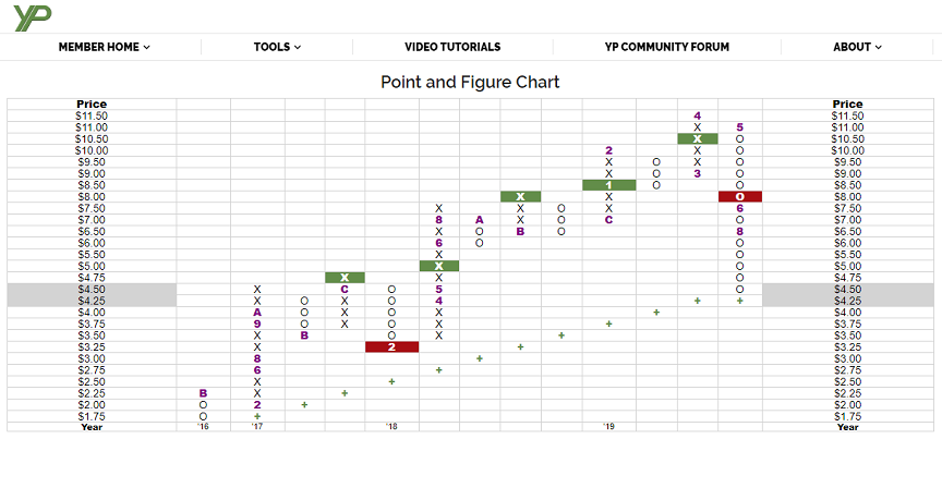
The X’s on the chart represent demand and an increase in the stocks price. The O’s on the chart represent supply and a decrease in the stocks price. The point and figure chart is made of these X’s and O’s. Within the chart each column can contain only X’s or only O’s.
Each individual box in the chart represents a stocks price. Moving up a box increases in price and moving down a box decreases in price.

The above image is a point and figure chart from YP Investors. Now you should have an idea of what all the X’s and O’s mean, but you might be wondering what the other stuff on the chart is? The purple letters and numbers represent the first mark on the chart for that particular month to help track time. 1-9 represents January through September and A, B, and C represent October, November, and December respectively. The year is shown on the bottom of the chart.
Point and Figure Charting Tutorial: The Easiest Way to See the Long Term Trend of a Stock
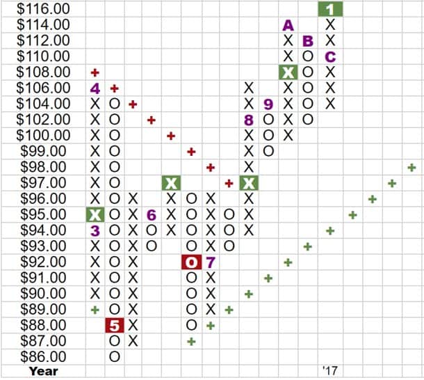
Additionally, the boxes with the plus’s in them represent positive and negative trend lines. These trend lines act as resistance lines and are hard to cross. The stock price may get close or even onto to these lines, but rarely will actually fully cross these resistance lines. This is how we can determine the long term trend of a stock. If the current trend line (which is the plus’s) is below the chart marks (which are the X’s and O’s), then this is called a bullish resistance line meaning the long term trend of a stock is positive and prices should rise.
As you can see in the image above the positive trend line is green and goes up as you go left to right. The bullish resistance line is colored green on the YP Investors Point and Figure Charts to show you that the stock prices should rise. If the trend line is above the chart marks (meaning the plus’s are above the X’s and O’s) then this is a bearish resistance line. This indicates that the trend of the stock is negative meaning the stocks prices should fall.
Again in the image above you can see a bearish resistance line that goes down as you go from left to right. YP’s point and figure charts colored this line red to show a negative trend and that the stock prices should fall. Join YP Investors with a free trial and let our tools do the calculations for you!
Point and Figure Charting Tutorial: Identify the Key Buy and Sell Signals to Help you Make the Big Money
Finally, we will go over the buy and sell signals in a point and figure chart. Let’s again reference the image above of a point and figure chart from YP Investors. The green and red filled boxes represent basic buy and sell signals. The green boxes represent a basic double top buy signal meaning the stock prices should rise after the chart hits that mark so this may be a good time/price to buy into that stock.
When purchasing a stock based on this buy signal you want to make sure to buy at a price that is no higher than the price that aligns with the green box. This will keep your investments more profitable. Once there are more chart marks (X’s) above this green box then you have most likely missed the rally and should wait for the next green buy signal.
Now lets go over the sell signals. The red filled boxes are basic double bottom sell signals meaning the stock prices should fall after this signal. When selling a stock based on this red box sell signal you want to make sure to sell at a price that that aligns with the red box. When you are ready to sell a stock this will help you sell at a price before it drops significantly. For example, you could use a point and figure chart to set a stop-limit or stop-loss order on a stock you own by setting the order price to the next sell signal price that could occur in the point and figure chart.
Point and Figure Charting Gives you a High Probability of Success
Remember these signals are a general statistical observation, just because a stock hits a buy or sell signal does not mean that stock is guaranteed to rise or fall, but it does have a higher probability of doing so. This gives you an educated idea of where the stock price is heading.
Point and Figure charts are a powerful tool that will help you make informed decisions on your investments and grow your wealth.
Be sure to watch our YP Investors Quick Tips Video on double, triple, and quadruple top buy signals! In this video you will learn about a couple of advanced chart patterns that have higher probability’s of predicting where stock prices will go. We also have a number of other Videos and Forum Posts that will help you be a successful investor.
We hope you enjoyed and understood this article about point and figure charting and put what you have learned to use! Good luck in your investments, grow them successfully and live the life you want!

I’m interested in joining your investor group, on your PF charts do you have more video tutorials on learning about it.
Hello,
Our most popular video is the Point and Figure Charting video on YouTube. We also have other Point and Figure Chart videos including Buy/Sell Signal Patterns, check them all out on YP Investors YouTube Channel!