YP Investors offers this Free Point and Figure Stock Chart so everyone can utilize the power of point and figure charting. With point and figure stock charts you will clearly see stock chart patterns for buy and sell signals, increasing your odds of profitable trading and investing.
Are you ready to make your portfolio a cash-flowing asset?
Sign-Up for our Course: How to Sell Options for Income – YP Investors Premium Investing Course
– Learn the secret to the wealthy: Finding low risk but highly profitable investments. This options strategy is exactly that and will turn your portfolio into a cash-flowing asset.
– This exact strategy is used by the YP Investors Founders to achieve over 70% annual returns.
– 13 Week Course: With our step-by-step guide learn for 20 minutes a day and by the end you’ll be able to create a cash-flowing asset!
– 1-Year Premium Membership to YP Investors included ($360 Value!) with World-Class Stock Analysis Tools, Alerts, and Top Stocks Lists.
On Sale Now! Enroll and start making money work for you!
Enter a Stock Symbol to see the magic happen!
Tip: Watch our Video Tutorial on Point and Figure Charts
P&F Frequently Asked Questions
P&F Chart Details
3-Box Reversal
| Price ($) | Box Size |
|---|---|
| 0-5 | $0.25 |
| 5-20 | $0.50 |
| 20-100 | $1.00 |
| 100-200 | $2.00 |
| 200+ | $4.00 |
Sick of all the Ads? Get a Membership to YP Investors for as little as $5/month and enjoy our free tools without the hassle of popups and ads plus access to our Premium Tools.
Want Free Stocks? Get $5-$200 in Free Stocks!

Chart Data
Latest Earnings Data
Latest Dividend Payments
Company Details
Historical Stock Splits
Point and Figure Chart Patterns
Buy Signals
Double Top
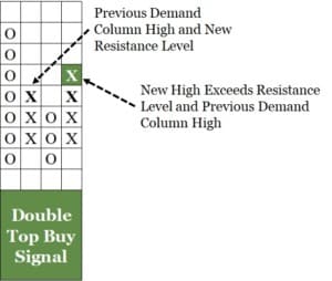
In a double top point and figure chart pattern demand is in control and there is a greater probability the stock price will increase. This is the most common buy signal in a point and figure stock chart.
Triple Top
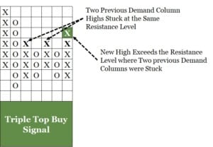
In a triple top buy signal chart pattern demand is in control and there is a greater probability the stock price will increase. This is a stronger buy signal than the double top.
Bullish Catapult
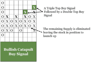
In the bullish catapult buy signal demand is in control and there is a very high probability the stock price will increase. This signal is a combo of a triple and then double top. The triple top hits and after the supply is extracted. Then the double top launches the stock price up. This is the strongest buy signal of all the point and figure chart patterns.
Sell Signals
Double Bottom
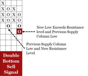
In a double bottom stock chart pattern supply is in control and there is a greater probability the stock price will decrease. This is the most common sell signal in point and figure chart patterns.
Triple Bottom
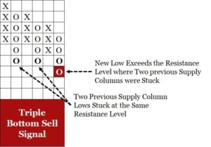
In a triple bottom sell signal chart pattern supply is in control and there is a greater probability the stock price will decrease. This is a stronger sell signal than the double bottom.
Bearish Catapult
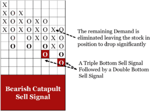
In the bullish catapult sell signal supply is in control and there is a very high probability the stock price will decrease. This signal is a combo of a triple and then double bottom. The triple bottom hits and after the demand is extracted. Then the double bottom launches the stock price down. This is the strongest sell signal of all the point and figure chart patterns.
Point and Figure Charting FAQs
What is Point and Figure charting? (What is a Point and Figure chart?)
Point and Figure Charts use the proven and reliable laws of Supply and Demand in economics. Supply and Demand have been around since the start of time. The stock chart shows if Supply or Demand is in control of the stock.
What do the X’s and O’s represent?
The X’s Represent the Demand (buying) and the O’s represent the Supply (selling).
How do you create a Point and Figure chart?
The chart is created by alternating columns of X’s and O’s. Strictly X’s or O’s are allowed in one specific column (a single column can’t have both.) To change columns (a column of X’s to a column of O’s or vise versa) it must reverse direction 3 boxes. The changing of columns back and forth creates the chart.
How are the X’s and O’s plotted onto the chart?
The potting of X’s or O’s on the chart is based on the stock’s daily highs and lows. First check the current column the chart is in, if X’s look at the daily high, did it rise? If yes, check if it rose enough to mark another X or multiple X’s in the current column. If it did not rise at all or enough to chart at least one X then check the low. Is the low point at least 3 boxes down from the current X column top? If so, plot the O’s into a new column, this is a reversal and Supply now has control. Continue through the same process but if Supply is in control, now the lows are looked at first and it takes a 3 box reversal to go to an new column of X’s.
How is this useful?
The point and figure chart ignores volatility and leaves you with a clear picture of the competition between Supply and Demand. When Demand is in control (column of X’s) the price of the stock goes up, and if Supply is in control (column of O’s) the price of the stock goes down.
How do you use a Point and Figure chart?
Both investors and traders use them to see buy and sell signals as well as long term trends. The chart patterns generated by the X’s and O’s clearly show where buy and sell signals are, unlike other technical stock chart patterns that can be hard to identify. The overall trend of a chart is also easy to determine on P & F charts because they filter out all the noise of stock price movement and the true supply and demand picture of the stock is displayed. When plotted it is easy to see the long term trend of the stock, is the chart going up or down as you go from right to left?
Hi, after a triple top breakout, for example, how does one determine price change? What predictive tools do you use?
Hey Bill,
Thank you for your question! The Triple Top Buy Signal is a stronger signal than the standard Double Top Buy signal because it has met that same resistance price 3 times and finally on the third time there was enough demand to overcome this. It is a stronger surge of demand because of the built up resistance at that level. You can have higher confidence the stock price will rise when it hits a triple top. If you would like to calculate a price objective (how high the stock price might go after this buy signal) see our post about Calculating the Bullish Price Objective (https://ypinvestors.com/price-analysis-from-a-buy-signal/)
I hope this helps and good luck on your investments!
-YP Investors Team
Where can I find the settings for box size and reversal in this P&F charts?
Also I was looking for SQ symbol’s chart. It does not show. Any explanation?
Thanks,
Vijay
Hi Vijay,
Thank you for reaching out! If you type in ‘SQ’ and push Enter or “Generate P&F Chart” our tool will display the chart for ticker SQ (Block). Sometimes with the smaller ticker symbols like in this case the autofill will not show it because there are too many possibilities, sorry about that.
In addition, our Point and Figure Charts do not have adjustable box size or reversal requirements. We do this to simplify the charting for our members and users. We use the 3-box reversal and auto-adjustable box sizes based on the stock price. These pre-determined sizes have been proven to show the most reliable picture of Supply and Demand as well as the most accurate Buy and Sell signals in Point and figure Charts.
Thanks again for your questions! I hope this helps,
–The YP Investors Team
The point and figure charts using the ATR ( Average True Range) are more accurate than the traditional charts. Could it be possible for YP Investors to include point and figure charts using the ATR at a length of (14) and reversal amount of (3)?
Your charting mechanism struggles with prices in the 5 figure range. $4 blocks at $200+ just doesn’t seem to cut it at that point. Those things move more than $20/day on a regular basis and generate wild swings on $4 blocks.